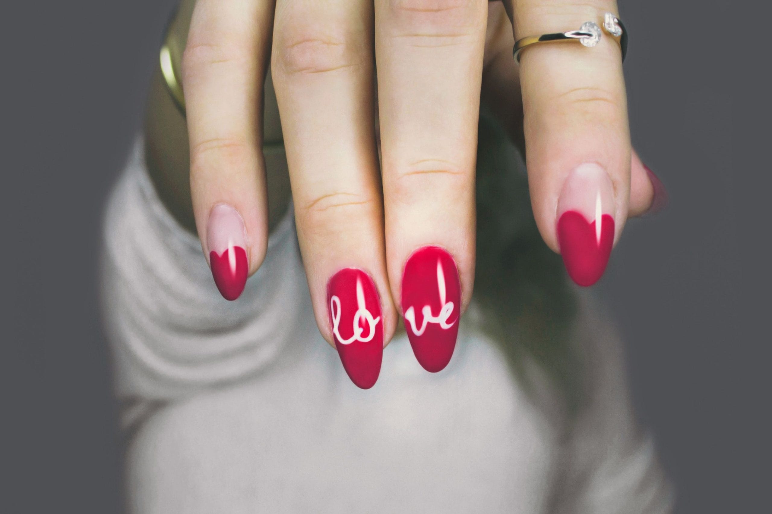
21 Classy Nail Designs for an Elegant Manicure
iAn elegant manicure isn’t defined by how much design work goes into it — often the opposite is true. This roundup moves beyond neutral-color-only territory and into real nail designs: patterns, textures, and small artistic details that still read as refined, not loud. What separates a classy design from a busy one usually comes down to three things: how much surface area the detail covers, how much contrast exists between the design and the base color, and whether the detail is placed with intention rather than repeated identically across all ten nails.
Each of these 21 designs is built around a single principle of quiet-luxury nail art — restraint, precision, and intentional placement — so you get visual interest without tipping into busy or trendy-for-five-minutes territory. For each one, you’ll find what the design actually looks like up close, who it tends to suit, how it wears over two to three weeks, and how to make it more subtle or more dramatic depending on your comfort level, so you can walk into your appointment with specific language instead of a vague “something elegant.”
Fine Line and Linework Designs
Thin, precise lines create structure and interest without adding bulk or color saturation. Because linework relies entirely on precision rather than coverage, it tends to look more expensive the thinner and cleaner the line is — a thick, uneven line reads as amateur no matter how good the color choice is underneath it.
1. Delicate Cuticle Line
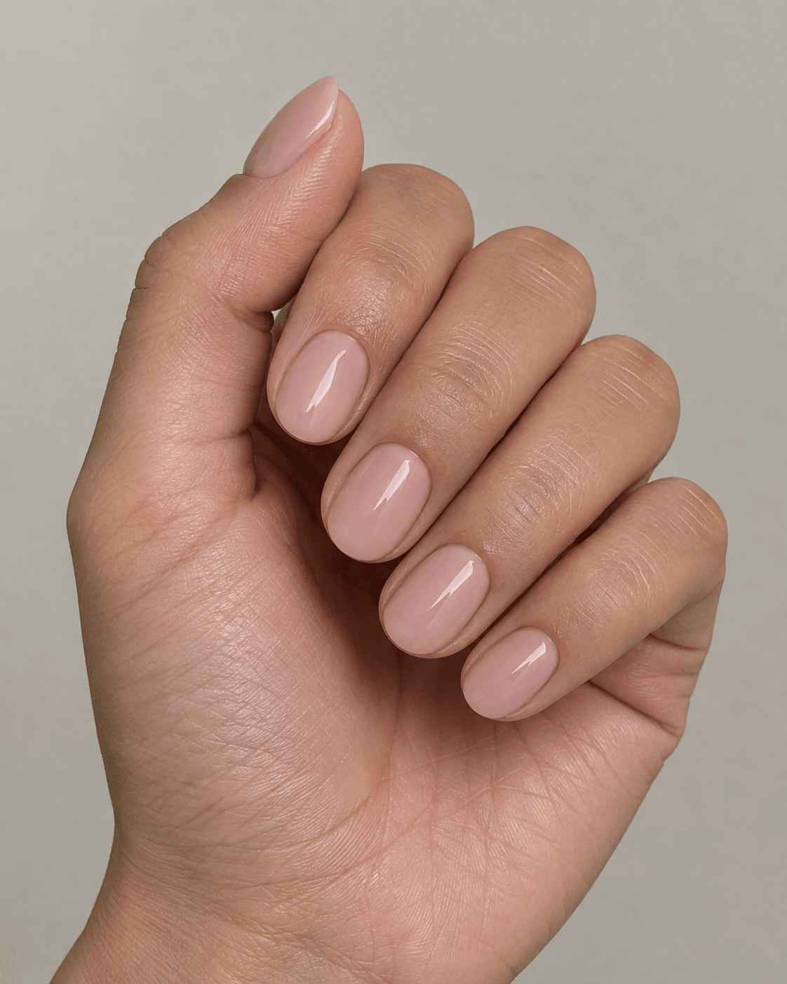
A single fine line traced just above the cuticle in a contrasting or metallic tone frames the base of the nail without covering any additional surface area, adding a jewelry-like detail that’s barely there until you look closely. The effect works because it borrows from how a thin gold chain sits against skin — it doesn’t compete with anything; it just adds a small glint of intention. This design suits almost any base color, though it shows most clearly against sheer or pale nudes where the contrast is visible without being harsh.
Maintenance-wise, this is one of the lowest-upkeep designs in the list: because the line sits right at the cuticle, regrowth doesn’t disrupt it the way a tip-based design would, so it can look fresh for the full length of your fill cycle. To make it more subtle, ask for the line in a tone-on-tone shade close to your base color rather than a full metallic contrast. To make it more dramatic, request a slightly thicker double line, or have it traced in a deeper jewel tone like emerald or garnet instead of gold. When describing it to your technician, the clearest phrasing is “a thin line, freehand or striping tape, right along the cuticle edge, not a full French line.”
2. Vertical Split Line
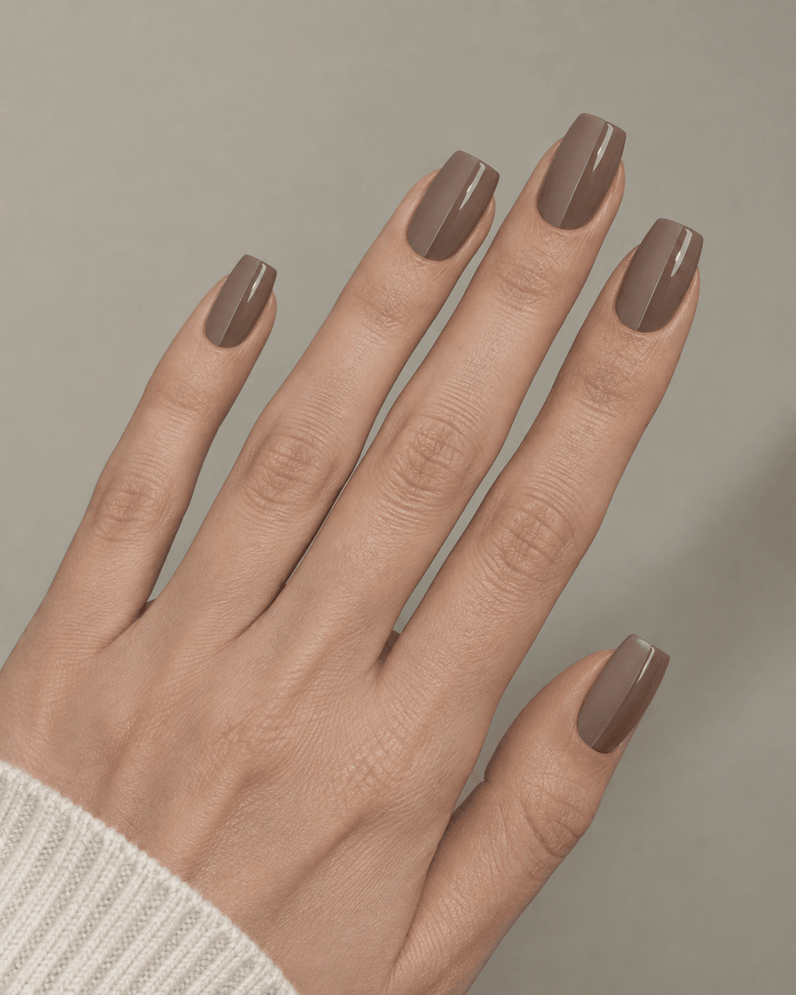
A single thin vertical line dividing the nail into two subtly different finishes — one matte, one glossy, in the same color family — creates dimension through texture contrast rather than color contrast. This is a more technically demanding design than it looks, since keeping the split line straight and centered requires a steady hand or striping tape as a guide, and any wobble in the line reads immediately because there’s no pattern to distract from it.
It suits people who want something that photographs differently depending on the light and angle, since the matte half absorbs light while the glossy half reflects it, giving the same nail two distinct appearances. This design holds up reasonably well over a fill cycle since there’s no tip-based element to grow out, though the line itself may need a light touch-up if it’s near the edge of wear. For a subtler version, keep both halves in the same finish family (satin and semi-matte, for instance, rather than full matte and full gloss) so the contrast is felt more than seen. For more drama, shift the split line off-center rather than down the middle, or use two genuinely different tones rather than one color in two finishes.
3. Diagonal Line Accent
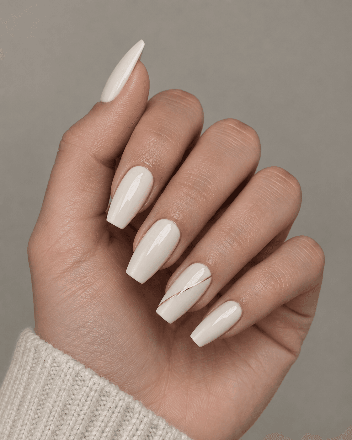
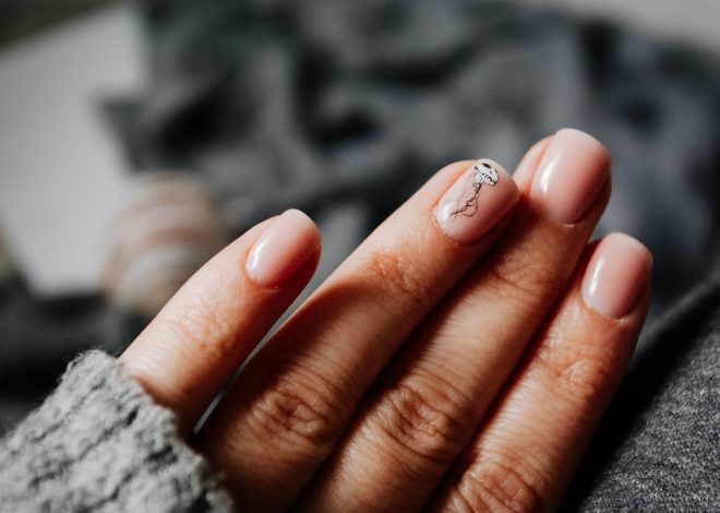
A single diagonal line across one or two accent nails, rendered in a fine metallic or contrasting tone, adds asymmetry and visual movement to an otherwise uniform set without requiring a full pattern. Because it’s confined to just one or two nails rather than repeated across the whole hand, it reads as a deliberate accent rather than a full design commitment — which is part of why it tends to photograph well without overwhelming the rest of the manicure.
This design suits people who like a bit of visual asymmetry but don’t want to commit to a full nail art set, and it’s a good entry point if you’ve never done nail art before and want to test the waters with something low-risk. As it grows out, the diagonal line will shift slightly relative to the nail’s edge, but because the line itself doesn’t rely on a hard boundary like a French tip does, this is barely noticeable until several weeks in. To soften it, request the line in a matte tone rather than metallic. To amplify it, ask for two parallel diagonal lines instead of one, or extend the accent to two or three nails instead of a single one.
4. Outlined French Tip
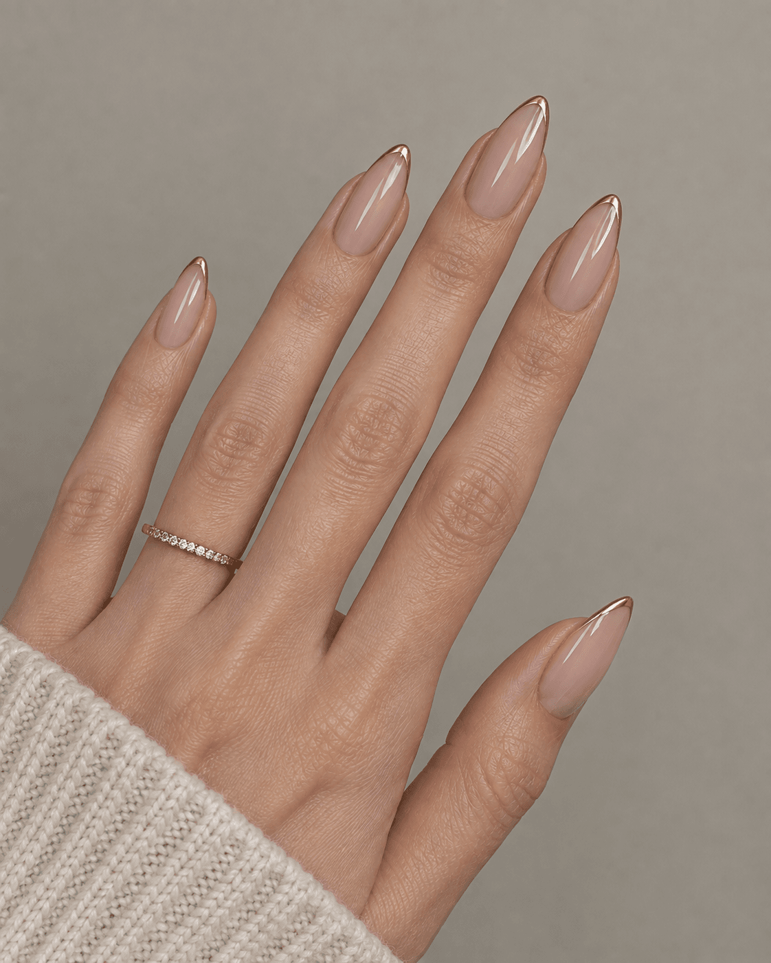
A traditional French tip redrawn with a fine outline in a metallic or contrasting shade rather than a solid block of white, giving the classic design a more graphic, modern edge. Instead of painting the entire tip white, the technician traces only the smile line itself — the curved boundary between the nail bed and the tip — leaving the tip transparent or matching the base color, so the outline does all the visual work.
This suits anyone who loves the structure of a French manicure but finds a solid white tip too stark or too closely associated with a more casual, everyday look. Because the outline sits along the smile line rather than covering the tip, it does grow out somewhat visibly as the natural nail extends, so this design benefits from slightly more frequent maintenance than a cuticle-based line if you want it looking crisp. For a quieter version, use a fine tone-on-tone outline instead of metallic. For more impact, pair the outlined tip with a colored or shimmer base rather than sheer nude, so the two elements read as one coordinated design rather than a single isolated detail.
Minimal Dot and Micro-Detail Designs
Small, precisely placed details add texture without competing with the base color. The key word here is placed — these designs work because the dots or details sit in a specific, considered spot rather than being scattered randomly or repeated in a rigid pattern across every nail, which starts to look more like a print than a manicure.
5. Single Cuticle Dot
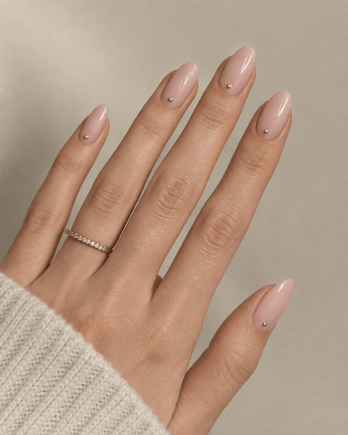
One small dot placed just above the cuticle line in a contrasting or metallic tone acts almost like a single stud earring — a small deliberate focal point rather than a pattern covering the whole nail. The size of the dot matters enormously here: anything larger than a pinhead starts to look like a mistake rather than a design choice, so this is a detail best left to a technician with a fine brush or a dotting tool rather than attempted freehand at home.
It suits people who want the smallest possible amount of nail art while still having something beyond a plain manicure, and it works across nearly every base color and finish. Because it’s positioned at the cuticle rather than the tip, it holds its position relative to the nail shape for the full fill cycle without looking grown-out. To dial it back further, use a dot in a shade only one or two tones darker than the base. To dial it up, add a second, smaller dot beside the first for a subtle cluster effect, or use a dot in a bold jewel tone against a neutral base for more contrast.
6. Scattered Micro-Dots on One Accent Nail
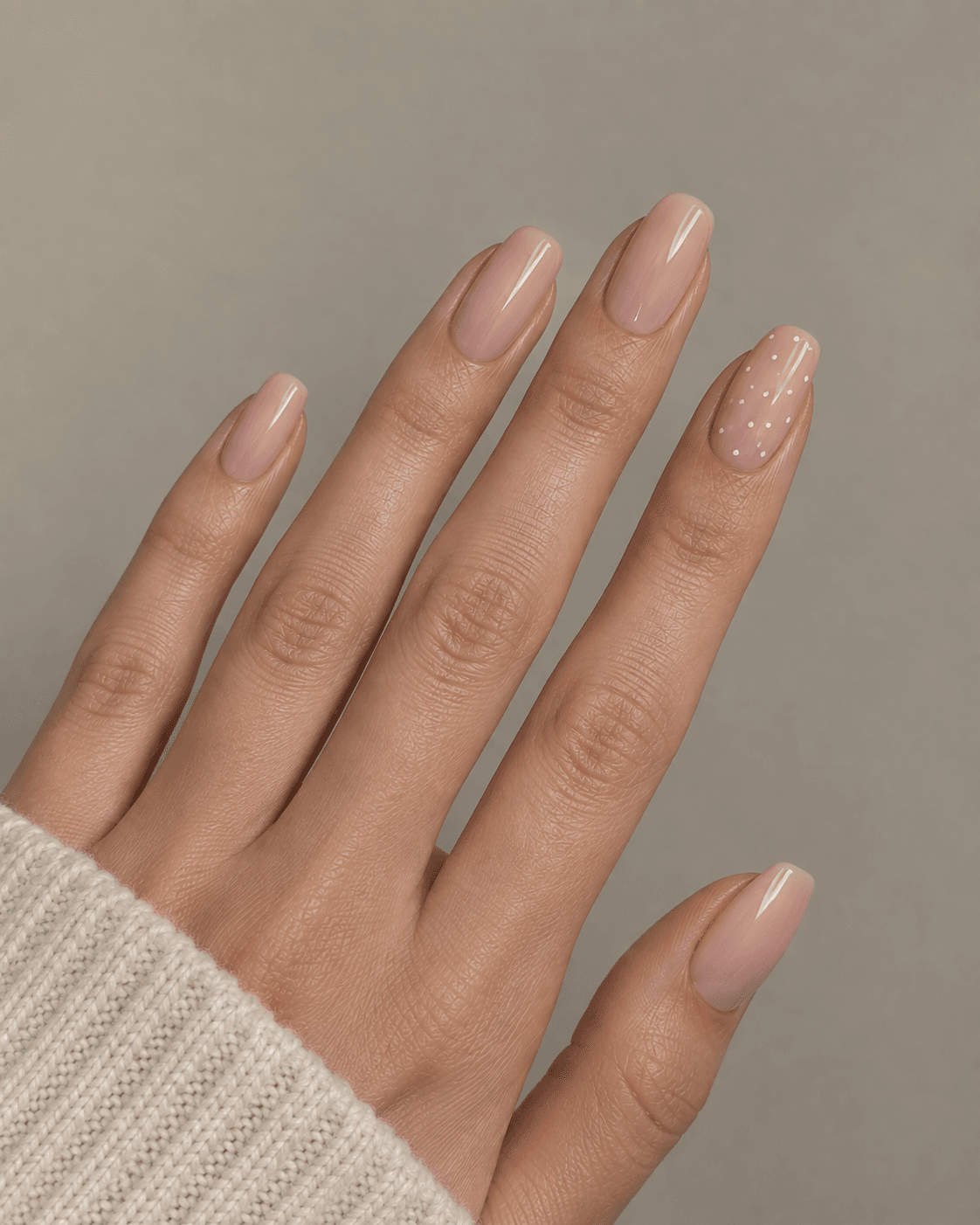
Rather than a dot on every nail, a cluster of very small, irregularly scattered dots on just one accent nail creates a starry, textured effect that reads as artistic without requiring symmetry or precision across the full set. Because the dots are deliberately irregular rather than evenly spaced, there’s more room for natural variation without it looking like an error — which makes this a slightly more forgiving design for a technician who’s still building precision skills, and a good option if you want something a little more expressive than a single dot but still contained.
This design suits people who want one “statement” nail within an otherwise minimal set, and it pairs especially well with a matte base, since the matte finish keeps the dots from disappearing into reflected light. As the accent nail grows out, the dot cluster shifts slightly with the nail but doesn’t lose its visual integrity the way a symmetrical pattern might. To soften the effect, keep the dots in a tone close to the base color. To make it bolder, use a metallic or pearlescent dot color, or extend the scattered-dot treatment to two accent nails instead of one.
7. Tiny Pearl Embellishment
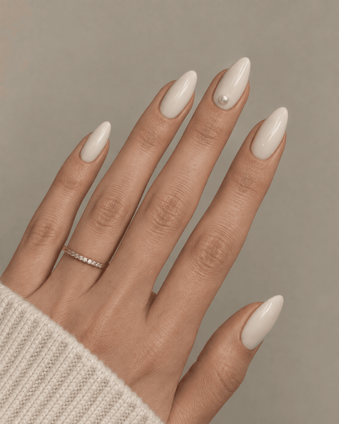
A single small pearl or pearl-effect bead placed near the base of one or two nails adds subtle dimensional texture, functioning more like a small piece of jewelry than a nail art pattern. Unlike painted designs, this is a physical embellishment applied with nail glue over the top coat, which means it sits slightly raised off the nail surface and catches light differently depending on the angle — closer to how an actual pearl earring would behave.
This suits special-occasion manicures especially well, since the raised texture, while durable, is more prone to snagging on fabric (tights, sweaters) than a flat painted design, making it slightly less ideal for everyday wear over several weeks. It works beautifully with ivory, white, or soft champagne base colors that echo the pearl’s own tone. For something quieter, request a flat-set pearl rather than a domed one, which sits closer to the nail surface. For more drama, use two or three small pearls in a cluster on a single accent nail rather than one pearl per nail.
Marbled and Blended Effects
Soft, blended color work reads as more sophisticated than sharp, graphic patterns, largely because blending removes the hard edges that make a design look “applied” rather than integrated into the nail itself. These effects require more technical skill than linework since the blending has to happen while the polish or gel is still workable, but the payoff is a finish that looks closer to natural stone or fabric than to painted nail art.
8. Soft Marble Veining
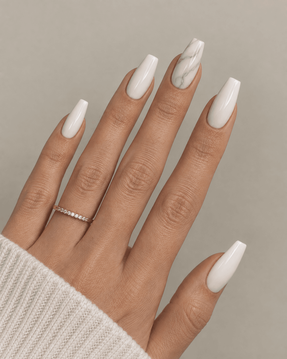
Thin, irregular veining in a soft grey or gold tone blended into a white or nude base mimics natural stone, most commonly requested as an accent nail rather than across the full set to keep the effect subtle. The technique typically involves dragging a fine brush or feather through wet polish to create organic, branching lines rather than painting each vein individually, which is part of why no two marble nails look exactly alike even when done by the same technician.
This design suits people drawn to a slightly more editorial, fashion-forward look while staying within a neutral palette, and it photographs particularly well in close-up shots where the veining detail is visible. Because the effect is somewhat delicate and detailed, it’s best kept to one or two accent nails rather than the full set, both for visual restraint and because marbling the entire hand can start to look busy rather than elegant. To soften it, use veining in a tone very close to the base (a warm grey vein on a warm white base, for instance). To intensify it, use a metallic gold vein for more contrast, or apply the marble effect to two accent nails positioned symmetrically (both pinkies, for example) rather than just one.
9. Ombré Fade Between Two Neutrals

A soft gradient blending from a lighter nude at the cuticle into a slightly deeper tone at the tip, with no visible hard line between the two shades, creates dimension while staying entirely within a neutral palette. This is typically achieved with a makeup sponge dabbing two polish shades together at the boundary, which is a technique many technicians can execute quickly and consistently, making it a relatively accessible design compared to fine linework.
It suits people who want their nails to feel dimensional and considered without any single loud element, and it tends to age gracefully through a fill cycle since the gradient itself doesn’t rely on a fixed line that regrowth would disrupt. For a quieter version, keep both shades within the same undertone family (two warm nudes, for instance) so the transition is nearly imperceptible. For a bolder take, use a wider contrast between the two shades — a pale ivory fading into a rich espresso, for example — so the gradient reads more clearly as an intentional design rather than a slightly uneven manicure.
10. Cloudy Blush Wash
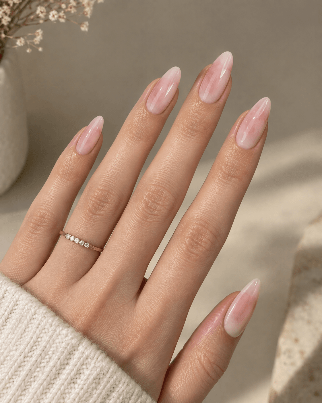
A soft, diffused wash of pale pink blended unevenly across a sheer white base, mimicking a watercolor effect, gives dimension without any hard edges or defined shapes. Unlike the ombré fade, which moves in one clear direction from cuticle to tip, the cloudy wash is intentionally irregular, with soft, cloud-like patches of color that vary slightly nail to nail rather than following a uniform gradient.
This design suits a softer, more romantic aesthetic than the sharper marble or linework options, and it works particularly well for bridal or spring-occasion manicures where a delicate, barely-there color story fits the overall look. Because there’s no hard edge or fixed line to grow out, it holds its appearance well across a full fill cycle, with only the natural nail growth at the base needing attention. To keep it extremely subtle, use a blush tone only one shade deeper than the white base. To make it more visible, deepen the blush to a dustier rose and allow slightly more coverage in the wash pattern.
Geometric and Structured Accents
Clean geometric shapes, used sparingly, read as modern and intentional rather than busy. The distinction between a geometric accent that looks classy and one that looks like a rushed nail art attempt almost always comes down to precision of the edges — a slightly crooked line or an uneven shape undermines the entire clean, structured effect these designs are going for.
11. Single Thin Rectangle Accent
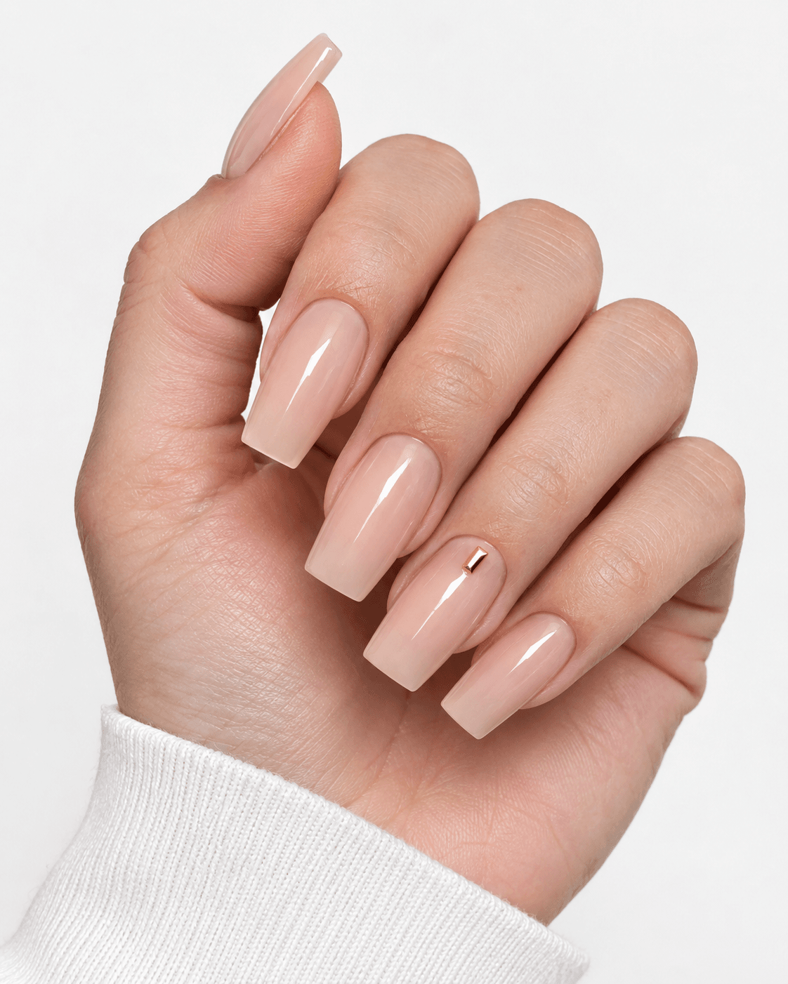
A small, precisely placed thin rectangle in a contrasting or metallic tone near the base of one nail introduces geometry without covering significant surface area, keeping the overall look minimal. The shape is typically no more than a few millimeters wide, functioning almost like a tiny bar or tally mark rather than a filled block of color, which keeps it from reading as bold or graphic despite being a defined geometric shape.
This suits people with a more architectural or minimalist aesthetic who still want a manicure that reads as “designed” rather than plain. Since the rectangle sits near the cuticle, it holds up well through a fill cycle without needing early touch-up. For an even quieter version, use an outlined rectangle (just the border, unfilled) rather than a solid block. For more visual weight, use two stacked rectangles in slightly different tones, or extend the accent to two nails positioned on the same hand.
12. Half-Moon Cuticle Design
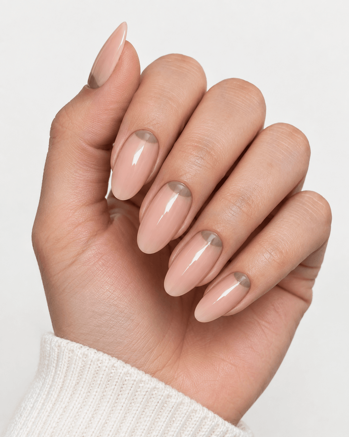
A modernized take on the classic half-moon manicure, with a crescent shape at the base of the nail in a contrasting tone against the rest of the nail, using a muted color pairing rather than the traditional stark contrast. Where the original half-moon trend from decades past often paired bold, saturated colors for maximum contrast, this modern version keeps both tones within the same neutral family, so the crescent shape reads as texture and dimension rather than a graphic statement.
This design suits people who like the structure of a defined shape but want it to stay firmly in “quiet” territory rather than becoming a focal point, and it has the practical advantage of naturally accommodating some regrowth, since the crescent sits right at the base where new growth appears anyway. To make it subtler, choose two tones that are barely distinguishable from a short distance. To make it more defined, increase the contrast between the crescent and the nail body, or use a metallic crescent against a matte nail for added dimension.
13. Thin Triangle Tip Accent
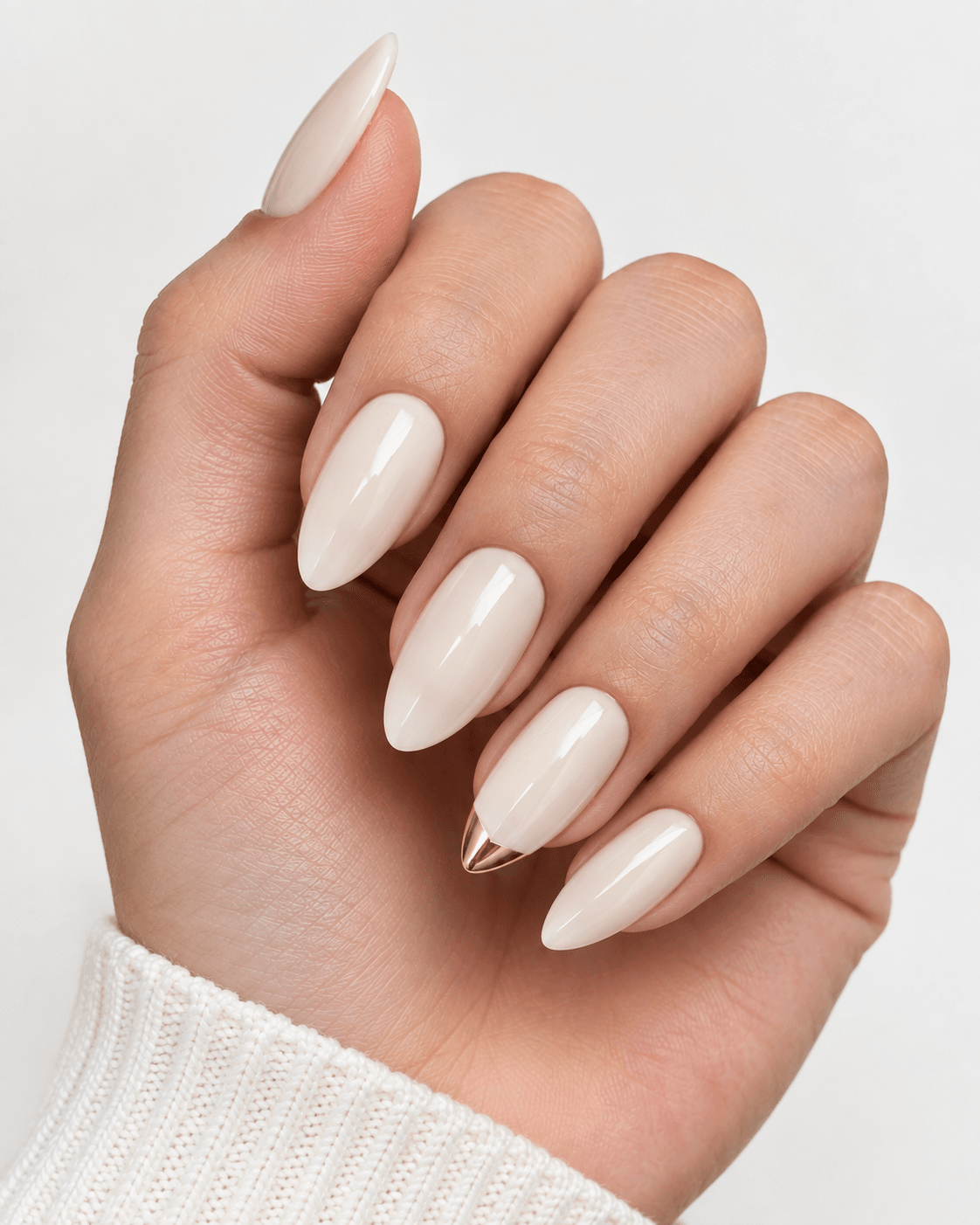
A small triangular shape at just the tip of one or two nails, in a metallic or contrasting tone, adds a subtle architectural detail reminiscent of a French tip but more angular and minimal. Rather than the smooth curve of a traditional French smile line, the triangle brings a sharper, more graphic quality to the tip while still occupying a similarly small amount of surface area.
This suits people who like the idea of a tipped design but want something with a bit more edge than the softness of a French manicure, and it tends to appeal to those drawn to minimalist, geometric jewelry as well. Because it sits at the tip, this design is more affected by nail growth than a cuticle-based detail, so it benefits from being paired with a shorter fill cycle if you want it looking crisp the whole time. For a quieter version, keep the triangle small and in a tone-on-tone shade. For more impact, use two nested triangles in different tones, or apply the accent to two nails rather than one.
Metallic and Shimmer Detailing
Metallics used sparingly add richness without overwhelming a neutral palette. The word “sparingly” is doing real work here — a full metallic manicure reads as bold and trend-driven, while a metallic detail confined to a small portion of the nail reads as refined, which is the entire distinction this section is built around.
14. Fine Gold Foil Fleck
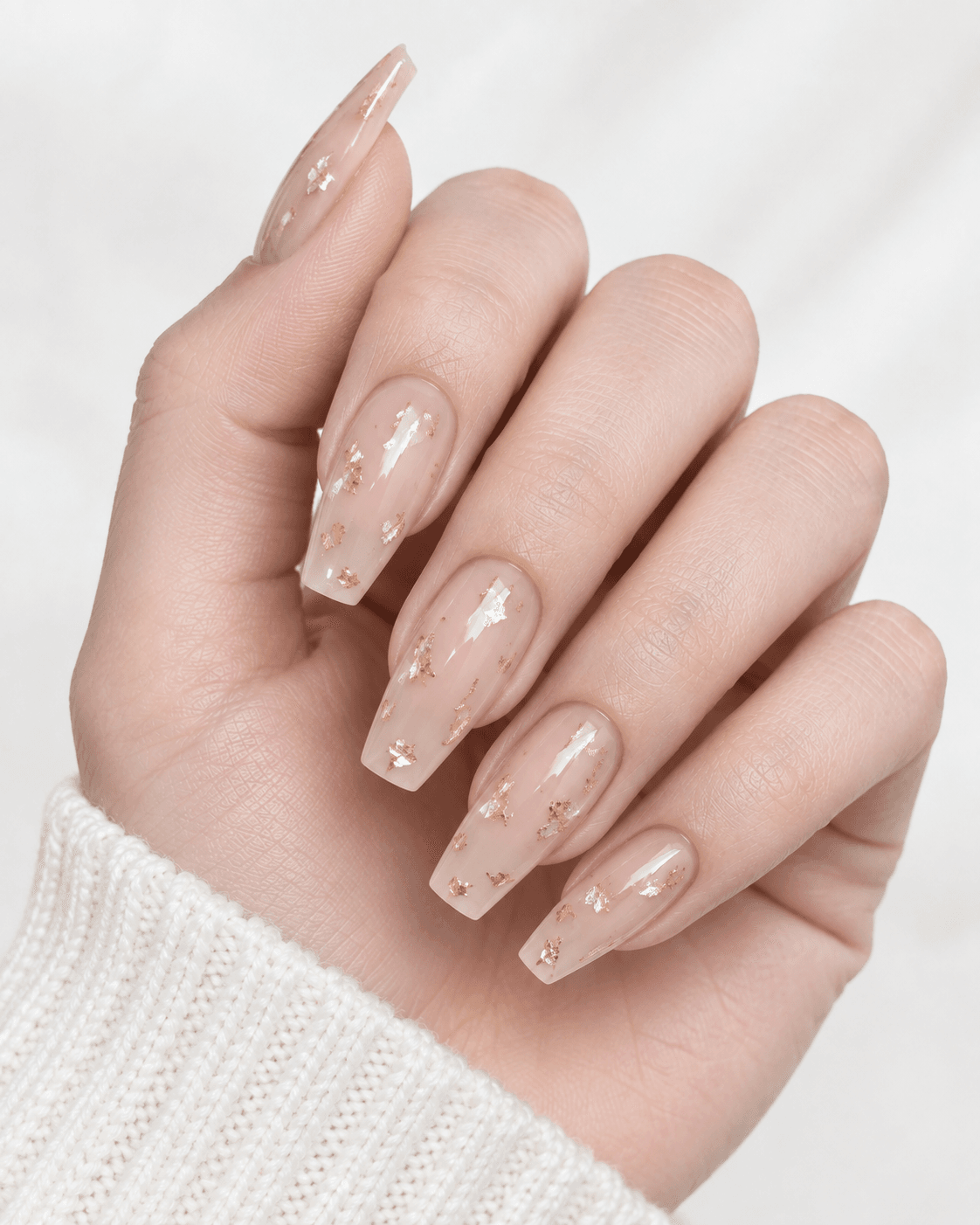
Small, irregular flecks of gold foil pressed into a sheer or matte nude base create a subtle glint of light without a full metallic or glitter finish, giving texture that photographs beautifully but stays understated in person. The foil is applied while the top layer of polish or gel is still tacky, so the flecks embed into the surface rather than sitting on top, which keeps the finish smooth to the touch despite the visual texture.
This design suits people who want a hint of shimmer for a special occasion without a full glitter or chrome look, and it tends to catch light differently depending on the angle, giving the nail a subtle liveliness in movement that a flat color doesn’t have. As the nail grows, the flecks — being scattered rather than positioned in a fixed spot — don’t create the same grown-out appearance a line or shape design would. For a quieter effect, use fewer, smaller flecks concentrated mainly at the base. For more shimmer, increase the density of the flecks or use silver foil against a cooler-toned base instead of gold.
15. Chrome Cuticle Cap
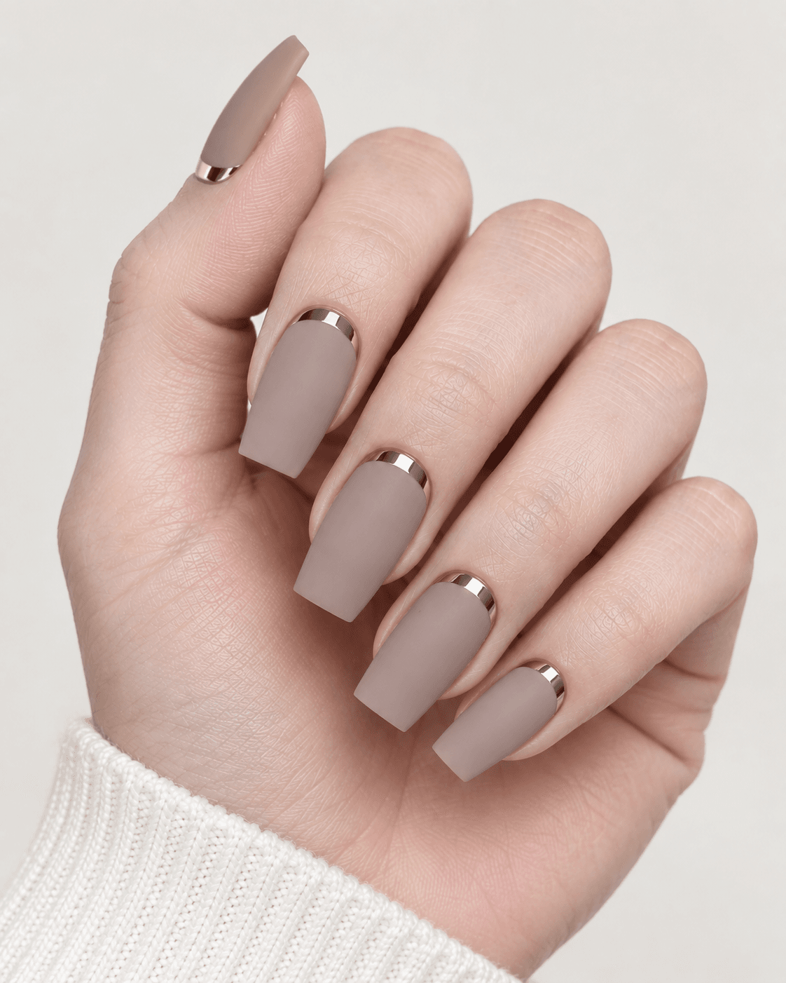
A thin band of chrome or metallic polish applied only at the very base of the nail, rather than the full surface, creates a modern cuticle-framing detail with a controlled amount of shine. This takes the visual impact of a full chrome manicure — which can read as very bold and reflective — and condenses it into a narrow strip, so the mirror-like effect becomes a framing device rather than the entire nail’s finish.
It suits people who are drawn to the chrome trend but want a version that reads as sophisticated rather than statement-making, and it pairs particularly well with a matte nail body, since the contrast between the flat matte surface and the reflective chrome band amplifies both textures. Because the band sits at the base, it holds its position well through a fill cycle, similar to other cuticle-anchored designs in this list. To soften it, use a slightly less reflective satin-chrome finish rather than a full mirror chrome. To make it more of a statement, widen the band slightly or add a second, thinner band just above the first.
16. Soft Shimmer Overlay
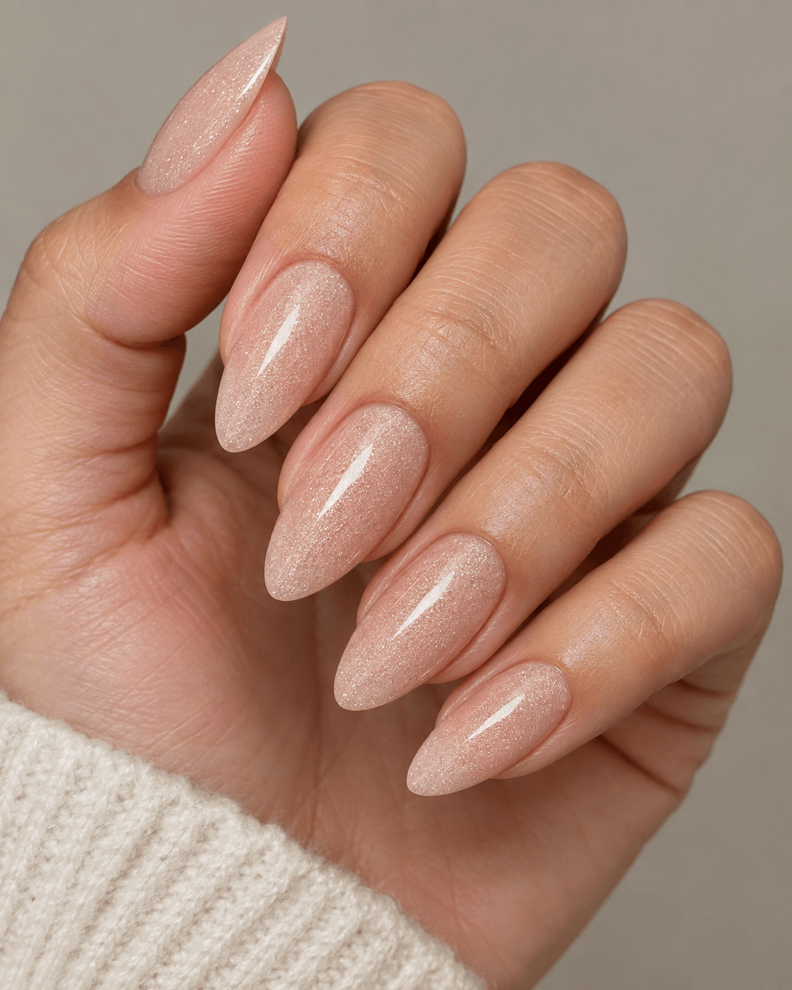
A fine, diffused shimmer polish layered over a matte or satin nude base adds subtle light-catching texture throughout, rather than a single accent, for an overall soft glow effect. Unlike the concentrated shimmer of the gold foil fleck or the bold reflection of chrome, this is an all-over, very fine shimmer — closer to how skin looks with a light highlighter than to true glitter or metallic polish — so it reads as a finish rather than a design element.
This suits people who want their entire set to feel a little more luminous without any single nail standing out as the “accent,” and it’s a strong option for evening or formal occasions where a bit of all-over glow suits the setting more than a sharp accent detail would. Because it’s an overlay across the whole nail rather than a localized detail, it wears fairly evenly through a fill cycle, though the shimmer may appear slightly less vivid nearer the tip as the base coat underneath wears thinner over time. For something quieter, choose a shimmer in the same undertone as the base color. For more presence, layer a slightly coarser shimmer, or apply it only over a deeper base tone where the contrast will be more visible.
Two-Tone and Contrast Designs
Pairing two closely related tones creates depth without the visual noise of a bold color clash. The principle running through this section is proximity — the two tones used should sit close enough together on the color wheel, or share enough undertone, that the contrast reads as intentional dimension rather than a mismatched pairing.
17. Two-Tone Tortoiseshell Effect
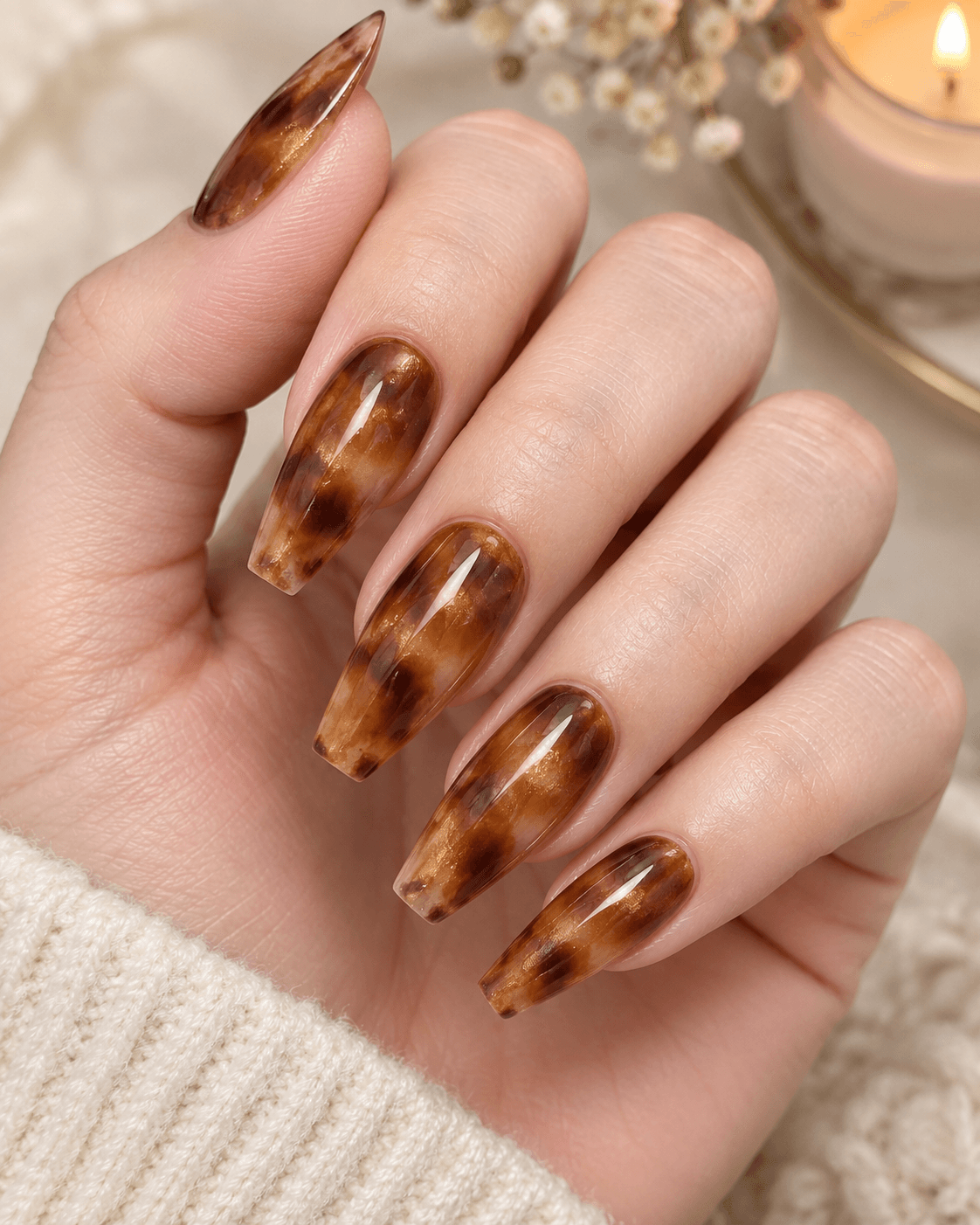
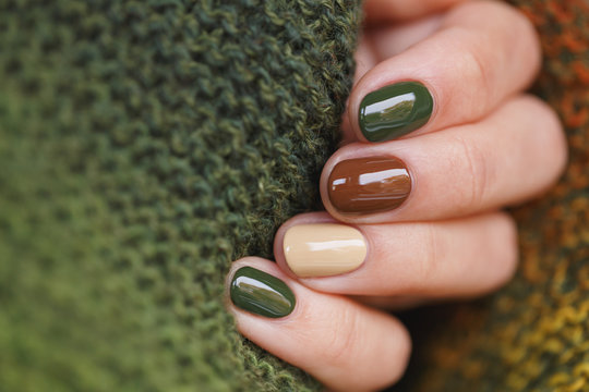
A soft, blended tortoiseshell pattern in warm browns and golds, kept muted rather than high-contrast, gives a rich, textured look that reads as sophisticated rather than trend-driven. The pattern is created by layering irregular blotches of two or three closely related warm tones and softly blending their edges, echoing the mottled appearance of actual tortoiseshell material rather than a sharp, repeating print.
This design suits people who want more visual richness than a solid color but still want the overall effect to feel organic and muted rather than graphic. It’s particularly well suited to autumn and winter styling, when warm browns and golds feel seasonally appropriate, and it tends to photograph beautifully in warm, low-angle light. As the nail grows, the mottled, irregular nature of the pattern means regrowth is less visually disruptive than it would be with a sharp geometric design. For a quieter version, keep all the tones within a narrow warm-brown range. For a bolder take, introduce a deeper amber or burnt orange into the blend for more visible contrast between the patches.
18. Alternating Matte and Glossy Nails
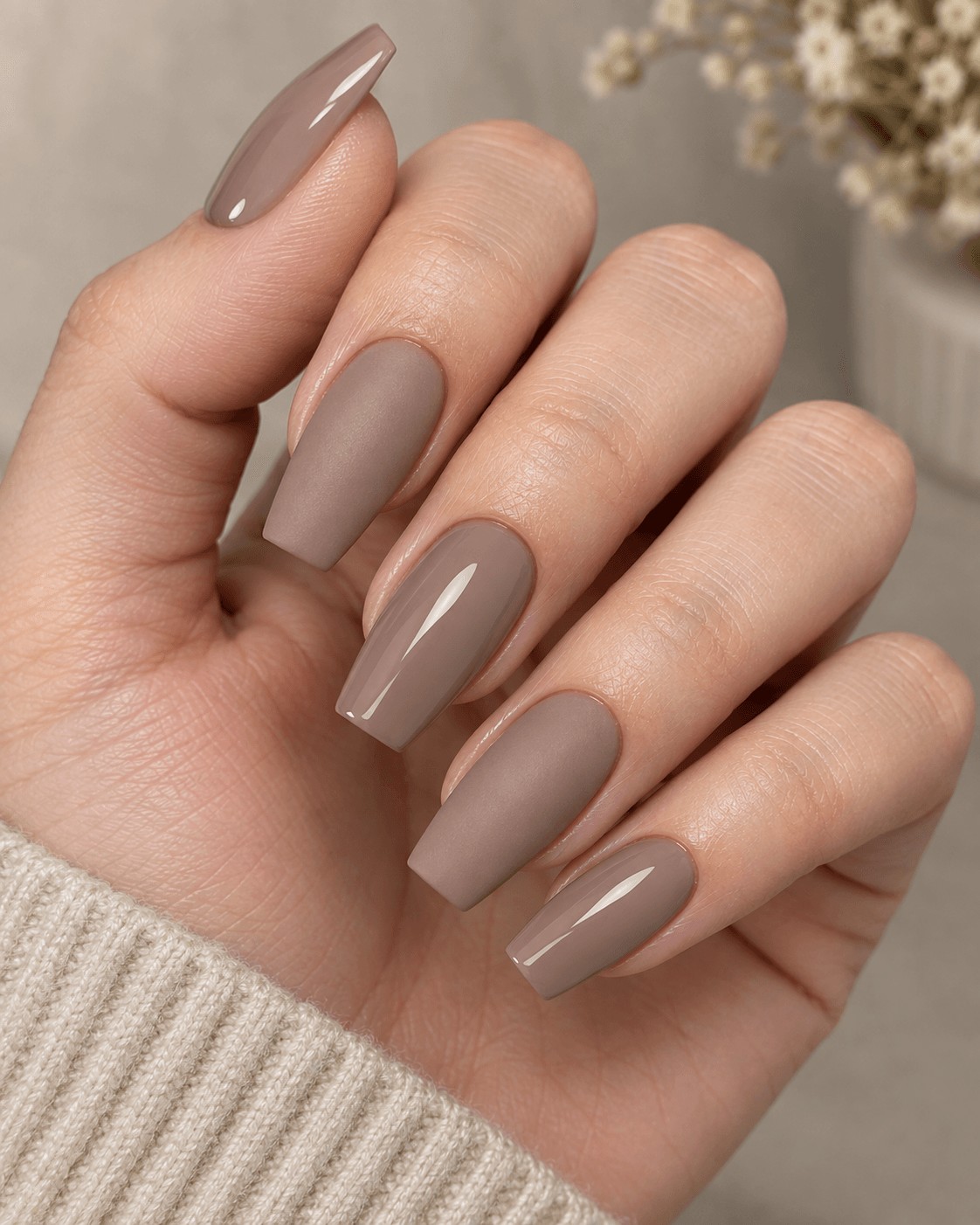
Rather than a pattern on each nail, this design alternates full matte and full glossy nails across the same base color, creating contrast through finish alone rather than color or line work. Typically, this means every other nail is matte while the rest are glossy, though some versions apply matte to just the ring finger as a single accent within an otherwise fully glossy set, which is a slightly subtler variation worth mentioning to your technician if you want less contrast overall.
This design suits people who appreciate a design that’s felt more than seen up close — from a distance the hand still reads as one cohesive color, and the finish contrast only becomes obvious when the light catches the nails at certain angles. It requires no ongoing touch-up specific to the design itself beyond normal fill maintenance, since there’s no line or shape to grow out. For a subtler version, apply the matte finish to just one nail per hand rather than alternating throughout. For more contrast, choose a base color with more inherent shine potential, like a deep red or burgundy, where the gloss-versus-matte difference is more visually dramatic.
19. Soft Color-Blocked Tips
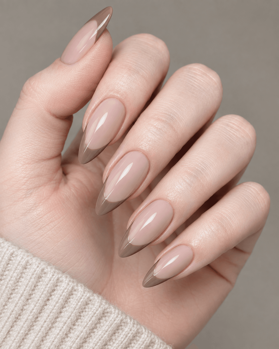
A distinct but closely related second tone applied only at the tips, rather than a French-style line, creates a subtle color-blocked effect that’s more graphic than a traditional French manicure but still restrained. Unlike a French tip, which typically follows the natural curve of the nail edge, a color-blocked tip is often applied as a straight or slightly angled line across the nail, giving it a more modern, architectural feel.
This design suits people who like the tipped-nail concept but want something with a cleaner, more contemporary edge than the classic French curve, and it works especially well when the two tones share the same undertone (both warm, or both cool) so the block reads as considered rather than accidental. Because the color block sits at the tip, it’s more affected by regrowth than a cuticle-anchored design, so it benefits from slightly more frequent maintenance if crispness matters to you. For a quieter version, keep the tip color close in depth to the base. For a bolder look, use a more saturated contrast tone at the tip, or angle the block diagonally instead of straight across.
Textured Finishes as Design Elements
Texture itself can function as the “design,” without any line work, color contrast, or embellishment. These finishes rely on how the nail feels and catches light rather than any visible pattern, which makes them some of the lowest-effort-to-maintain options in this whole list, since there’s no line, shape, or boundary to grow out or touch up.
20. Velvet Matte Texture
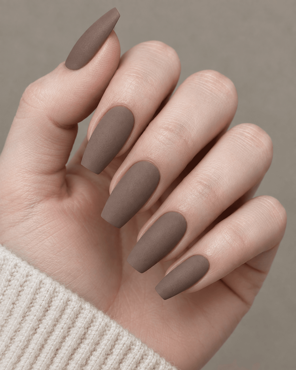
A fully matte finish with a slightly more pronounced, velvety texture than standard matte polish, achieved through a specific topcoat, gives the nail a soft, tactile quality that reads as luxurious without any additional detailing. Where a standard matte topcoat simply removes shine, a velvet-matte topcoat adds a finer texture that’s genuinely perceptible to the touch, not just visually different from a glossy finish.
This design suits people who want their manicure to feel deliberate and expensive without a single additional design element — the finish alone does the work. It suits deeper, richer tones especially well (deep taupe, espresso, wine) since the matte texture tends to soften highly saturated colors in a flattering way. Because it’s a finish rather than a placed design, it requires no special maintenance beyond a typical fill, though matte topcoats can dull slightly faster than glossy ones with heavy hand use, so an occasional matte topcoat refresh between fills can keep the texture looking its best. For an even softer look, pair the velvet finish with a paler, more muted color. For more drama, apply it over a deep, saturated jewel tone where the texture-versus-color contrast is more pronounced.
21. Subtle Textured Overlay on One Accent Nail
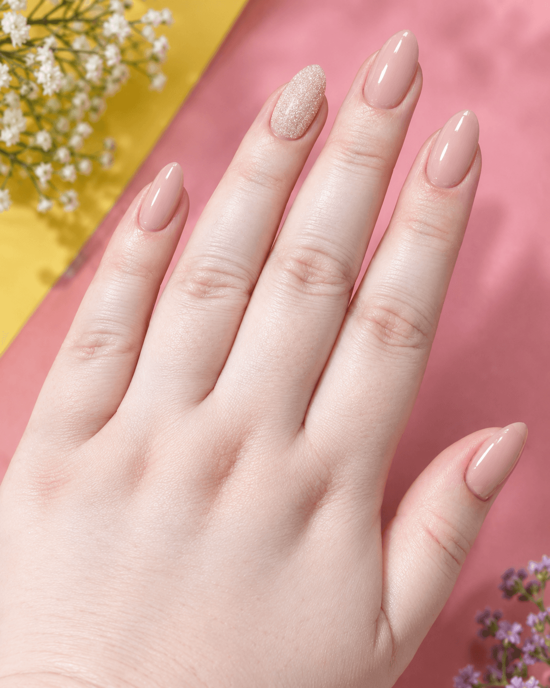
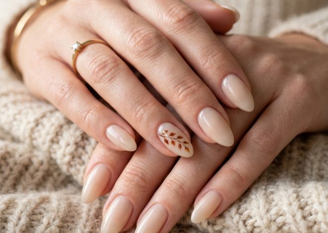
A fine textured topcoat — a soft sandy or crackled effect — applied to just one accent nail while the rest stay smooth, introduces tactile variety without changing color or requiring precision line work. This is one of the simplest designs on the list to execute, since it doesn’t rely on freehand steadiness the way linework or dot work does — the texture comes from the product itself rather than the technician’s hand.
It suits people who want just one point of difference within an otherwise uniform, smooth set, and it’s a particularly good option for anyone whose nails see a lot of hand use during the day, since a slightly textured surface can be marginally more forgiving of small surface scuffs than a high-gloss finish. As it grows out, the textured accent nail doesn’t require different maintenance from the rest of the set — it follows the same fill schedule. For a subtler version, choose a very fine, barely-there texture. For more impact, use a more pronounced crackled or sand-textured finish, or extend the textured treatment to two nails positioned symmetrically across the hand.
How to Decide Which Design Fits Your Comfort Level
If you’ve never done nail art before, start with a single-nail treatment rather than a design repeated across all ten — the cuticle dot, the diagonal line accent, or the marble accent nail are all low-commitment ways to test whether you like having a detail at all before building up to something more involved. Also, f you know you want texture or interest across the whole set rather than a single point, the finish-based options (velvet matte, alternating matte-and-gloss, shimmer overlay) tend to be the most forgiving as they grow out, since none of them depend on a fixed line or shape holding its position.
If your priority is longevity between salon visits, favor cuticle-anchored details over tip-anchored ones — dots, half-moons, and cuticle lines all hold their visual integrity through a full fill cycle, while tip-based designs like the outlined French tip or color-blocked tips will look best in the first two to three weeks and start to shift as the natural nail grows underneath.
What to Ask Your Nail Technician
Most of these designs work best as an accent-nail treatment rather than applied across all ten nails — ask specifically for “one accent nail” if you want the design to feel intentional rather than overwhelming. For fine line and dot work, mention that you want the detail kept small and precise, since technicians will often scale a design up unless told otherwise. If you’re unsure how a design will wear over two to three weeks, ask about placement near the tip versus the cuticle: cuticle-based details stay looking fresh longer than tip-based details, since regrowth doesn’t affect them the same way. And if you’re nervous about committing to a design you’ve never tried, ask your technician whether it can be tested on a single nail first before you decide to extend it further.