
6 Fashion Mistakes That Can Throw Off Your Proportions
You have stood in front of your mirror wearing something that you know, individually, is a beautiful item. Good fabric. Correct size. Colour that suits you. And yet something about it is off. The outfit is not working, and you cannot immediately identify why. You have tried adding a necklace. You have tried removing the belt. You have switched the shoes twice. Nothing quite resolves the specific wrongness of what you are looking at.
What you are almost certainly experiencing is a proportion problem.
When an outfit doesn’t work, stylists don’t start by questioning the body or the garment. They start by looking at the outfit as a whole. Most styling issues come from a few recurring visual problems: the outfit divides the body in an awkward place, visual weight sits too heavily in one area, or the outfit lacks enough structure to feel intentional.
Proportion is one of the most fundamental — and least discussed — principles of dressing well. It is more important than the specific item you choose, more important than the trend you are or are not following, more important in many cases than the budget you spent. A £40 dress worn with correct proportional understanding will consistently look more polished than a £400 dress worn without it.
Trends change each season, but the principles behind body proportions in fashion remain consistent. When clothing works with natural lines instead of against them, outfits look balanced, intentional, and effortless.
Understanding proportion is not about conforming to a body type label or following rigid rules about what your shape “should” wear. It is about understanding how the visual relationships between different elements of an outfit — the lengths, the volumes, the placement of detail, the role of footwear, the horizontal and vertical lines created by seams and hemlines — affect how the entire outfit reads. And more specifically: it is about identifying the small, specific mistakes that quietly undermine outfits that should be working and replacing each one with a simple, concrete fix.
These are the six proportion mistakes that appear most consistently across every body type, every budget, and every aesthetic. The one that applies to you is probably the one that solves the “something is off” problem you have been experiencing for longer than you realize.
Mistake 1: Matching Volume for Volume — The Outfit That Swallows You
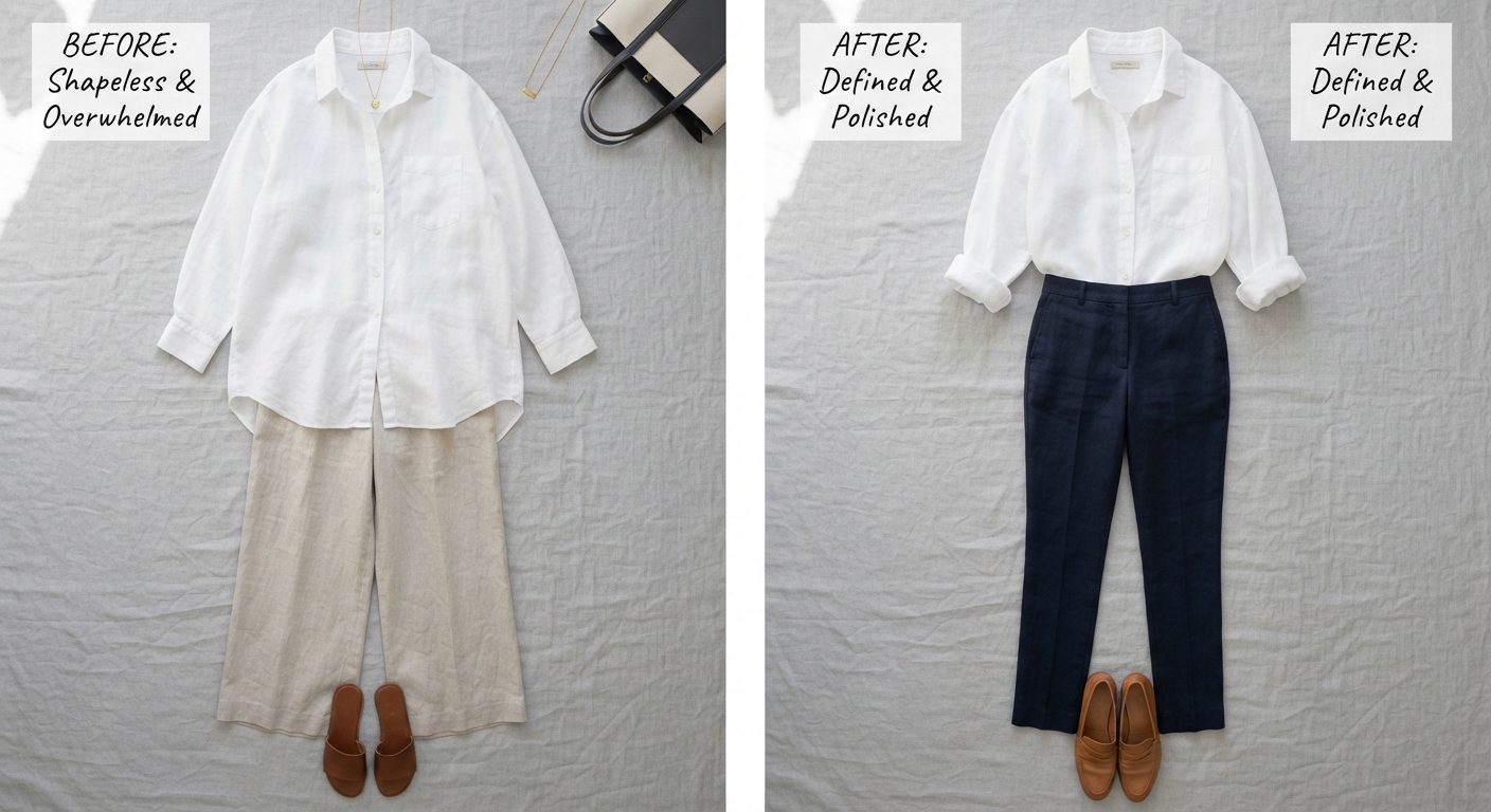
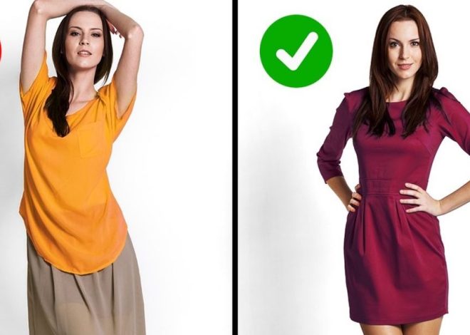
The most common proportion mistake is wearing everything the same volume. All-loose outfits lack definition; all-tight outfits leave no breathing room. The art is in contrast — playing fitted against relaxed to create a visual story.
This is the proportion mistake that is most consistently present in the wardrobes of people who describe themselves as having “no style” — not because they lack taste, but because they have been dressing in the single volume that feels most comfortable without realizing that comfort and proportion are two different considerations.
The baggy top with baggy jeans mistake is the most visible version: the outfit that has abandoned any relationship between the clothing and the body beneath it, creating a silhouette that reads as shapeless rather than relaxed, swamped rather than comfortable. There are a couple of mistakes women tend to make when it comes to volume distribution. The first one is too much volume all over. A baggy top with baggy jeans is really tough to pull off in real life without looking sloppy.
But the same mistake operates at the opposite extreme. An extremely tight, form-fitting top paired with extremely tight, form-fitting trousers creates a different proportion problem: the outfit has no visual breathing room, no counterpoint, no contrast. The result reads as unvaried in a different direction — too uniform, too one-note, lacking the interest that contrast creates.
The principle: Volume needs a counterpart. One element of an outfit should be doing the volume work — the oversized blazer, the wide-leg trouser, the flowing maxi skirt — while the other element anchors it through fit. This contrast is what creates the visual rhythm that makes an outfit look deliberate rather than accidental.
The specific fixes:
Oversized top: Pair with fitted or slim-cut trousers, a straight-leg jean, or a tailored skirt. Tuck the front hem slightly to break the volume at the waist rather than allowing it to fall uniformly to the hips. Relaxed wide-leg trousers: Pair with a fitted or slightly fitted top. The wide leg creates the volume below; the fitted top balances it above. Oversized everything: If the oversized-over-oversized look is genuinely what you want, add the one element that reins in the volume: crop the top so the hemline creates a waist reference even without actual waist definition, or add a belt that gathers the excess fabric and creates a single defined point in the silhouette.
The stylist test: Hold your hand horizontally at the widest point of the outfit’s silhouette. Now hold it horizontally at the narrowest. If the two measurements are equal — if the outfit has produced a uniform tube from shoulder to hemline — volume contrast is what the outfit needs.
Mistake 2: Breaking at the Widest Point — The Hemline and Hem-Length Problem
Proportion is created by where an outfit visually breaks the body. Stylists often aim for uneven divisions rather than splitting the body in half. When an outfit creates a clear difference between the upper and lower sections, it tends to feel more dynamic and intentional.
The place where a hem falls — the bottom edge of a jacket, top, dress, or skirt — creates a horizontal line across the body. And horizontal lines draw the eye across the body at whatever point they are positioned. This is not a styling opinion or a trend-dependent preference. It is visual perception science: horizontal lines slow the eye and expand the perceived width at the point they cross.
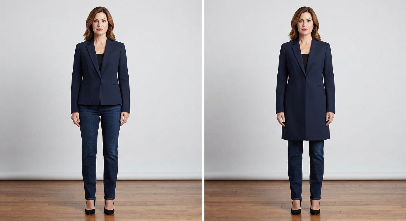
The mistake is allowing hemlines to fall at the widest part of the body — typically the widest point of the hip for most people — rather than above it, below it, or at a genuinely flattering natural break point. A jacket that ends exactly at the widest hip point draws the eye precisely there and frames that width, making it appear wider than it is. The same jacket falling three inches longer or shorter — below the hip or above it — removes the horizontal emphasis entirely.
Sometimes it’s not the dress — it’s the length. Something about the combination just doesn’t work, and more often than not it’s because the hemline is landing at an unflattering point.
The universal hemlines that avoid the widest-point problem:
Just above the knee: The knee is a vertical interruption in the leg’s line that provides a natural and flattering break point for most people. Hemlines that end just above the kneecap draw the eye to one of the narrowest parts of the lower body. Below the knee: A hemline at mid-calf or below draws the eye past the widest hip point entirely, elongating the lower body rather than interrupting it. At the natural waist: The true waist — the narrowest point of the torso — is the most universally flattering hemline for any top that is being tucked or worn cropped. A hemline at this point defines rather than obscures the waist.
The hemlines to reconsider:
Mid-thigh: The mid-thigh hemline on a skirt or dress draws the eye to the thigh, which is for many people a wider point than the knee. Not problematic on its own — but worth conscious consideration. Mid-calf (on straight or fitted skirts): The mid-calf point can visually shorten the lower leg if a fitted silhouette draws the eye to that horizontal line. The same length on a flowing or bias-cut skirt is less problematic because the fabric movement prevents the static horizontal line from dominating. Exactly hip-width: A hem at the precise widest point of the hip in any garment — jacket, cardigan, tunic — should be the first hemline you assess when an outfit is reading as wider than you want it to.
The jacket exception: A very long jacket that falls below the hip to mid-thigh or knee creates a vertical line rather than a horizontal emphasis, because the length of the jacket becomes the dominant visual element rather than its end point. The issue is specifically with shorter jackets or tops that end at or near the widest point.
Mistake 3: Ignoring the Role of the Waist — The Half-and-Half Error
This is the styling principle most described by the “rule of thirds” reference: stylists often aim for uneven divisions rather than splitting the body in half. Combinations that visually divide the body into roughly one third and two thirds often work better than perfectly equal halves.
The half-and-half outfit — a top that ends exactly at the hip, creating an equal division between the top and bottom halves of the body — is the most common single proportion mistake made by people who feel their outfits are not working but cannot identify why. The problem is not the individual garment. It is the 50-50 division it creates.
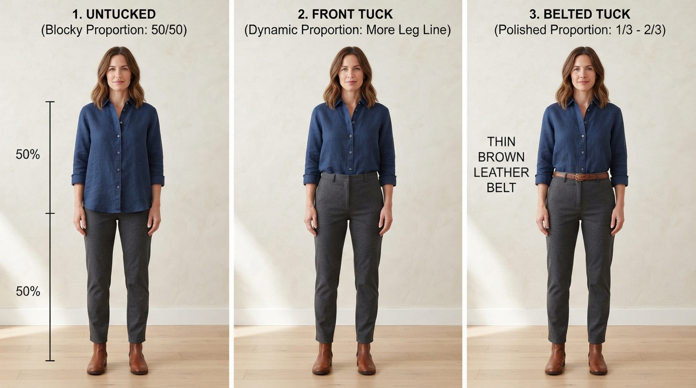
When an outfit is divided exactly in the middle — equal amounts of visual weight above and below the hip — the body reads as stockier and less dynamic than when the division is unequal. The eye requires a decision about where to go, and without a clear lead, it reads the entire silhouette as a uniform block. An uneven division — more vertical proportion above and less below, or a deliberate long-over-short or short-over-long combination — gives the eye a clear path and creates the visual movement that makes an outfit appear elegant.
An age-old styling formula for one simple reason: it’s universally flattering. The rule of thirds breaks the body into three parts — specifically one-third top and two-thirds bottom.
The three fixes for the half-and-half problem:
The tuck: Tucking the front of a top into the waistband — even a partial tuck of only the very front section — creates an uneven division without changing the garment at all. The tucked section reads shorter, the back and sides remain at their natural length, and the waist is referenced without requiring a full tuck or a change of outfit. This is the most powerful single styling move available for the half-and-half problem.
The high-rise bottom: A high-rise trouser or skirt that sits at or above the natural waist shifts the division point upward, creating a longer lower section and a shorter upper section — the one-third/two-thirds relationship that reads as more dynamic. The same top that creates a 50-50 division over low-rise trousers creates a more flattering proportion over high-rise.
The statement belt: A belt at the natural waist — the narrowest point between the rib cage and the hip — creates the waist reference that breaks the 50-50 division and provides the visual anchor that an untucked, unbelted outfit lacks. It does not need to be wide or statement in its design. Even a thin, understated belt at the correct placement point changes the entire proportional reading of the outfit.
The critical placement detail: The belt, the tuck, and the waistband must be positioned at the true natural waist — not at the hip, not at an arbitrary midpoint — for the proportion benefit to work. The natural waist sits approximately two inches above the navel, at the narrowest point between the ribs and the hip bones. A belt positioned at the hip does not reference the waist; it simply adds a horizontal line at the widest point, which compounds the problem rather than resolving it.
Mistake 4: Forgetting That Shoes Are Part of the Proportion Equation
Ignoring the role of shoes. Heeled shoes change your entire proportional relationship — leg length, hip alignment, and trouser break all shift. Proportion-aware dressing accounts for footwear as part of the equation, not as an afterthought.
This is the mistake that produces the “something is still off” feeling that persists even after every other element of the outfit has been correctly assembled — because the footwear was selected after the outfit was built rather than as part of the proportion system.
Footwear affects the outfit’s proportion in three specific ways simultaneously:
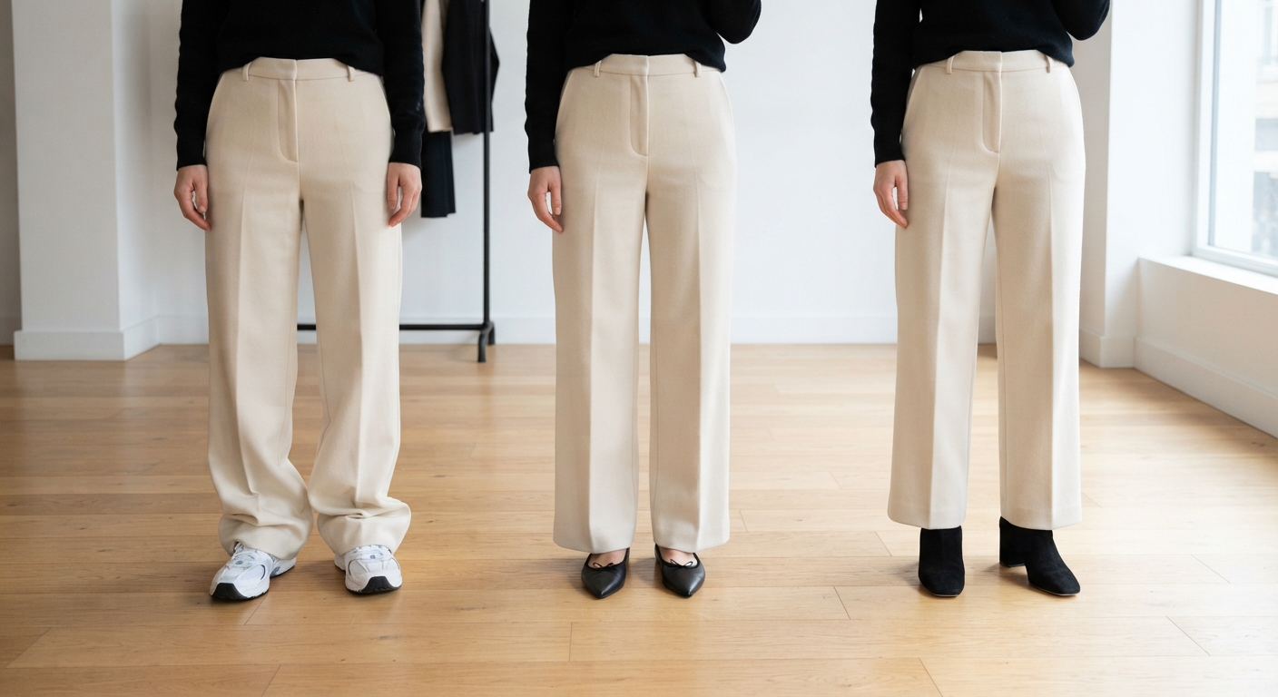
Leg-length relationship: A heel — any heel, even a modest two-inch block heel — adds vertical length to the lower leg. This shifts the entire visual proportion of the outfit upward, making trousers hit differently against the shoe, making a midi skirt hemline appear at a different point on the leg, and making the torso appear shorter or longer relative to the leg depending on the silhouette. The same outfit worn with flats reads with completely different proportions from the same outfit worn with heels. Neither is categorically correct — but they are not interchangeable.
Trouser break and hem contact: The “trouser break” — the amount of fabric that gathers at the front of the trouser leg where it meets the shoe — is entirely determined by heel height. A trouser that was hemmed for wear with heels produces too much fabric stack when worn with flats. A trouser hemmed for flats shows an awkward gap when worn with heels. The shoe is not an accessory to the trouser. It is a structural element of how the trouser functions.
Ankle visibility and leg continuity: A shoe or boot that cuts across the ankle — creating a horizontal line across that specific point — visually shortens the leg at the ankle. A shoe that creates an unbroken line from the hem to the floor — through skin tone approximation, a barely-there strap, or a nude shoe — creates the appearance of an uninterrupted leg line. The platform that cuts directly across the ankle does not elongate. It interrupts.
A heel would make it feel even shorter and throw off the proportions. A shorter dress can also feel more modern and relaxed with a simple sneaker.
The shoe selection principle: Decide on the shoe before finalizing the outfit, not after. The heel height determines the trouser break, the hemline position, and the leg-length visual. An outfit system that has been built around the shoe is always more proportionally successful than one where the shoe was added at the end.
The specific fixes by silhouette:
Wide-leg trousers: Require a heel high enough to clear the floor without dragging and to prevent the wide volume of the leg from appearing to swamp a flat shoe. A pointed-toe flat can extend the leg line sufficiently for shorter wide-leg proportions; a block heel provides the safest universally flattering result. Midi skirt: The midi hem’s position — mid-calf — can either elongate or shorten the leg depending on shoe choice. A pointed toe or a heel that adds vertical continuation to the leg elongates. A chunky flat shoe that creates a strong horizontal line at the hem shortens the visual leg line. Cropped trousers: Specifically designed to show the ankle. A shoe that extends this visible ankle area — a pointed flat, a slingback, a low ankle boot — continues the leg line. A thick-soled shoe or a boot that covers the ankle removes the intentional exposure that makes cropped trousers work.
Mistake 5: Wearing the Wrong Scale of Print or Detail — The Pattern That Overwhelms
Clothing proportion goes beyond silhouette. Fabric weight and print scale matter just as much. A garment that is too tight or too oversized can distort natural balance, but a print or detail at the wrong scale does the same thing through an entirely different mechanism.
Print scale is the relationship between the size of the pattern on a garment and the size of the person wearing it — and when this relationship is misaligned, the result is an outfit that appears to overwhelm its wearer rather than being worn by them. A very large-scale print on a smaller-framed person, or a very small, busy print on a taller or larger-framed person, both produce a visual imbalance that reads intuitively as something being wrong without most observers identifying precisely what it is.
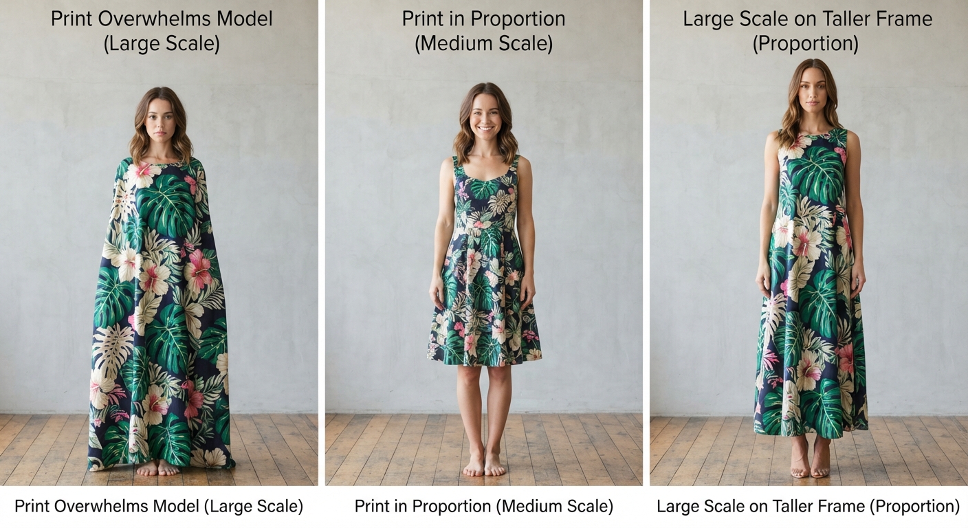
The mechanism is visual weight distribution: a large, bold print draws the eye to every part of the body it covers simultaneously, creating a uniform field of visual attention that does not allow the eye to rest or to prioritize any particular area. A small, busy print creates visual noise — the eye cannot resolve the pattern into meaning, and instead experiences the garment as undifferentiated texture.
Print scale guidelines:
For smaller frames: Smaller to medium-scale prints are in proportion with the visual scale of the person wearing them. A large-scale floral on a petite frame creates the impression that the print is wearing the person rather than the reverse. The print’s reference elements (the flower, the geometric, the animal print repeat) should be roughly thumb-sized or smaller at the scale of the garment.
For taller or larger frames: Medium to large-scale prints are in proportion. A very small, ditsy print across a larger surface area creates visual busyness without definition. Larger-scale prints provide the visual boldness that the greater surface area they cover requires.
For any frame: The placement of the largest or most visually prominent part of the print matters. A pattern that places its most prominent elements at the widest physical point emphasizes that width. A pattern that places its most prominent elements at a narrower point — the upper chest, the shoulder line, the center vertical — draws the eye to that narrower area instead.
Detail scale follows the same logic: Oversized pockets on a smaller frame, tiny delicate buttons on a larger frame, and collar proportions that are not in relationship with the wearer’s face and shoulder width are all the same principle applied to specific garment details rather than prints.
The rule of scale accessories: A very large frame in very large-scale statement jewelry appears cohesive because the scales match. The same large-scale statement necklace on a very delicate frame overwhelms the person wearing it in exactly the same way a large-scale print does. Scale coherence — matching the visual weight of accessories and details to the scale of the person wearing them — is the principle that makes the difference.
The practical test: Hang the garment against a wall and step back three metres. Does the print appear balanced and readable as a pattern? Can you see the individual elements clearly, or does it blur into texture? Then hold the garment up against yourself in the mirror. Is the repeat of the print roughly proportional to your shoulder width? If a single repeat of the pattern spans more than your shoulder width, it is likely large-scale for your frame.
Mistake 6: Missing the Vertical Line — The Outfit That Has No Visual Length
Stylists often aim for uneven divisions rather than splitting the body in half. But beyond where the body is divided, there is a second vertical proportion principle that is equally important and equally often missed: the presence or absence of a continuous vertical line through the outfit that gives the eye a path to travel.
Vertical lines elongate. Horizontal lines widen. This is the foundational principle of optical illusion dressing, and it applies not only to obvious elements like stripes but to every line present in an outfit — the edge of a lapel, the placement of buttons down a shirt front, the seam line of a trouser, the hemline of a top over a skirt, the placement of a pocket, the open line created by an unbelted coat.
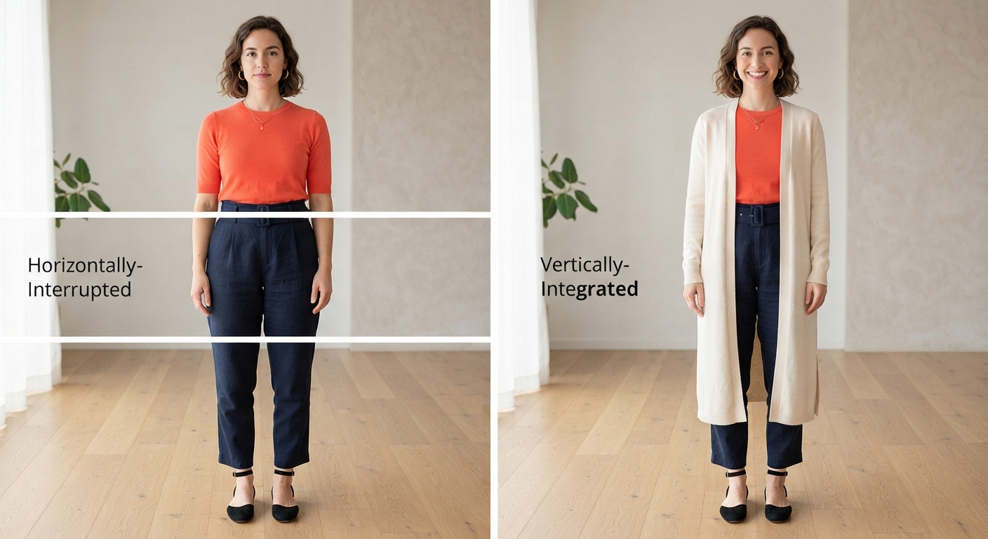
The outfit that is missing a vertical line is the outfit that the eye reads as a series of horizontal interruptions — each hemline, each pattern break, each color change creating a pause rather than a continuation. The result is an outfit that appears shorter and wider than its actual dimensions because the eye is being repeatedly stopped and redirected horizontally rather than encouraged to travel vertically.
The elements that create vertical lines:
Button-front shirts and jackets: The button placket running down the center front creates a strong vertical reference that draws the eye from collar to hem in a single movement. V-necklines: The V-shape directs the eye downward and inward toward the center, creating a vertical movement that elongates the neck and torso simultaneously. Pinstripes and vertical stripe prints: The clearest and most direct vertical line available in fabric pattern. Tonal dressing (one color head-to-toe): When there is no color break between the top and the bottom of the outfit, the eye has no horizontal stop point and travels the full vertical length of the outfit. This is why monochrome outfits consistently produce an elongating effect regardless of the specific silhouette. Long layers: A long cardigan, a longline coat, a duster vest — any long layer that falls in a continuous vertical line past multiple hemlines beneath it creates a dominant vertical element that overrides horizontal interruptions.
The elements that interrupt vertical lines:
Color blocking with equal weight: A bright top and an equally bright contrasting bottom of similar visual weight creates a stark horizontal stop point at the waistline. Horizontal stripes across the widest point: The stripes themselves are fine. Their placement across the widest horizontal point of the body doubles the widening effect of the stripe and the width simultaneously. Tucked shirt with a different-colored trouser and a shoe that does not extend the leg line: Three separate horizontal stop points — the waistline, the hemline, and the shoe line — dividing the body into three equal segments with no vertical continuity between them.
The tonal dressing principle specifically: The overarching theme in contemporary styling is Lived-In Luxury, and tonal dressing is perhaps its most powerful expression. Wearing one color head to toe — varying only in texture and fabric weight rather than in color — creates the longest, most uninterrupted vertical line available without any structural change to the garments themselves. A camel top with camel trousers and a camel shoe does not need a vertical stripe or a V-neck to elongate. The absence of horizontal color interruption does the work.
The practical fix for a horizontally interrupted outfit:
Add one vertical element. This is always simpler than it sounds. An open, longline cardigan over a color-blocked outfit provides a vertical layer that overrides the horizontal block. A V-neck top replaces a crew neck and adds vertical direction to the neckline. Switching from a color-contrast shoe to a nude or skin-tone-approximating shoe removes the horizontal line at the ankle. A long pendant necklace adds a vertical reference to a neckline that had only horizontal movement. Any one of these changes applied to the most horizontally-interrupted outfit in your wardrobe will produce an immediately perceptible improvement in the proportion reading.
The Master Checklist: Six Questions to Ask Before You Leave the House
Every proportion problem can be diagnosed by asking six specific questions about the outfit in the mirror:
1. Does one element have volume and the other have fit? If both elements are loose or both are tight, add contrast.
2. Does any hemline fall at the widest point of my body? If yes, adjust the length up or down to break above or below that point.
3. Is the outfit creating a 50-50 division? If yes, add a tuck, raise the waistband, or add a belt at the true natural waist.
4. Did I choose the shoes before or after the outfit? If after, check the trouser break, the hemline position, and the ankle line created by the shoe.
5. Is the print or detail scale in proportion with my frame? If the print elements are larger than your shoulder width, the scale is too large. If the print is creating visual noise rather than pattern, it may be too small or too busy for the scale of the garment.
6. Does the eye have a vertical path through the outfit? If not, add one element that creates vertical movement — a long layer, a V-neck, a tonal color story, or a long pendant.
A Note on Rules and Personal Style
Everything in this guide is a tool, not a mandate. The most important thing about dressing is that you feel like yourself in what you are wearing. These proportion principles are the background framework that makes “yourself” look as intentional and polished as possible — not a set of restrictions that override your aesthetic instincts.
We rarely tell clients to dress for their body shape anymore. Instead, we teach them proportion — how to balance volume and structure, so they look good in a wide range of silhouettes, not just the one their body shape “allows.” It is more flexible, more modern, and ultimately more empowering.
Understand the principles. Use them when an outfit is not working. Set them aside when the outfit is working, and you feel good in it. The goal of proportion awareness is always more confidence and more intentionality — never more self-consciousness.
ENDING:
The “something is off” feeling that makes people abandon otherwise good outfits has a name. It has a mechanism. And — as this guide demonstrates — it has a fix that is almost always simpler and less expensive than buying something new.
Six mistakes. Six specific, concrete, immediately applicable corrections. The outfit that was not working because of volume uniformity is fixed by a tuck. The outfit that felt wide is fixed by adjusting the hemline. The outfit that felt stuck is fixed by adding a vertical line. None of these corrections require a new garment, a larger budget, or a different body.
They require only the understanding of what proportion is, why it matters, and how to read it in the mirror before you leave the house.
Save this to Pinterest, share it with everyone who has described their entire wardrobe as “nothing looks right,” and apply one principle from this guide to tomorrow’s outfit. Just one. The difference will be immediately visible.
That is how quickly proportion works when you know what you are looking for. ✨

One thought on “6 Fashion Mistakes That Can Throw Off Your Proportions”